Com
Brand Identity │UI/UX │Social Media
Com was the outcome of a “wicked problem” design project, which involved identifying an issue and then developing a design solution toolkit, of which my focus was on mental health support. Part of my solution was creating “Com”, an organization that caters to helping assist those with PTSD and sensory conditions. Developing “Com” allowed me to practice designing tools that essentially fill the gaps of society, and help to support those in need, which was a fulfilling goal to achieve. This multi-faceted project allowed me to comprehend successful applications of a single visual system to various mediums.
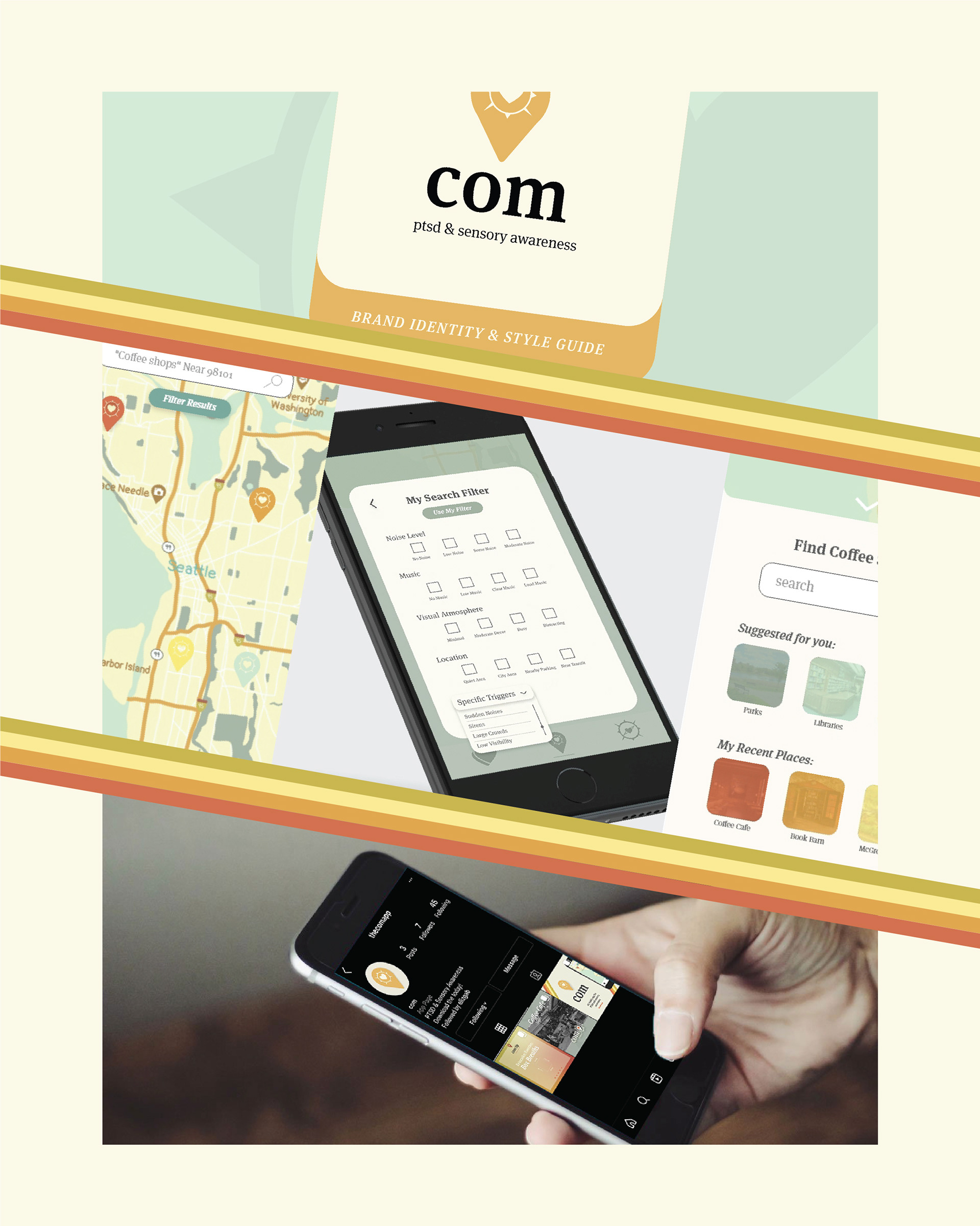
Building Com involved developing three final deliverables: A brand identity and style application guide, a mobile application, as well as branding social media platforms to expand the organization's reach.

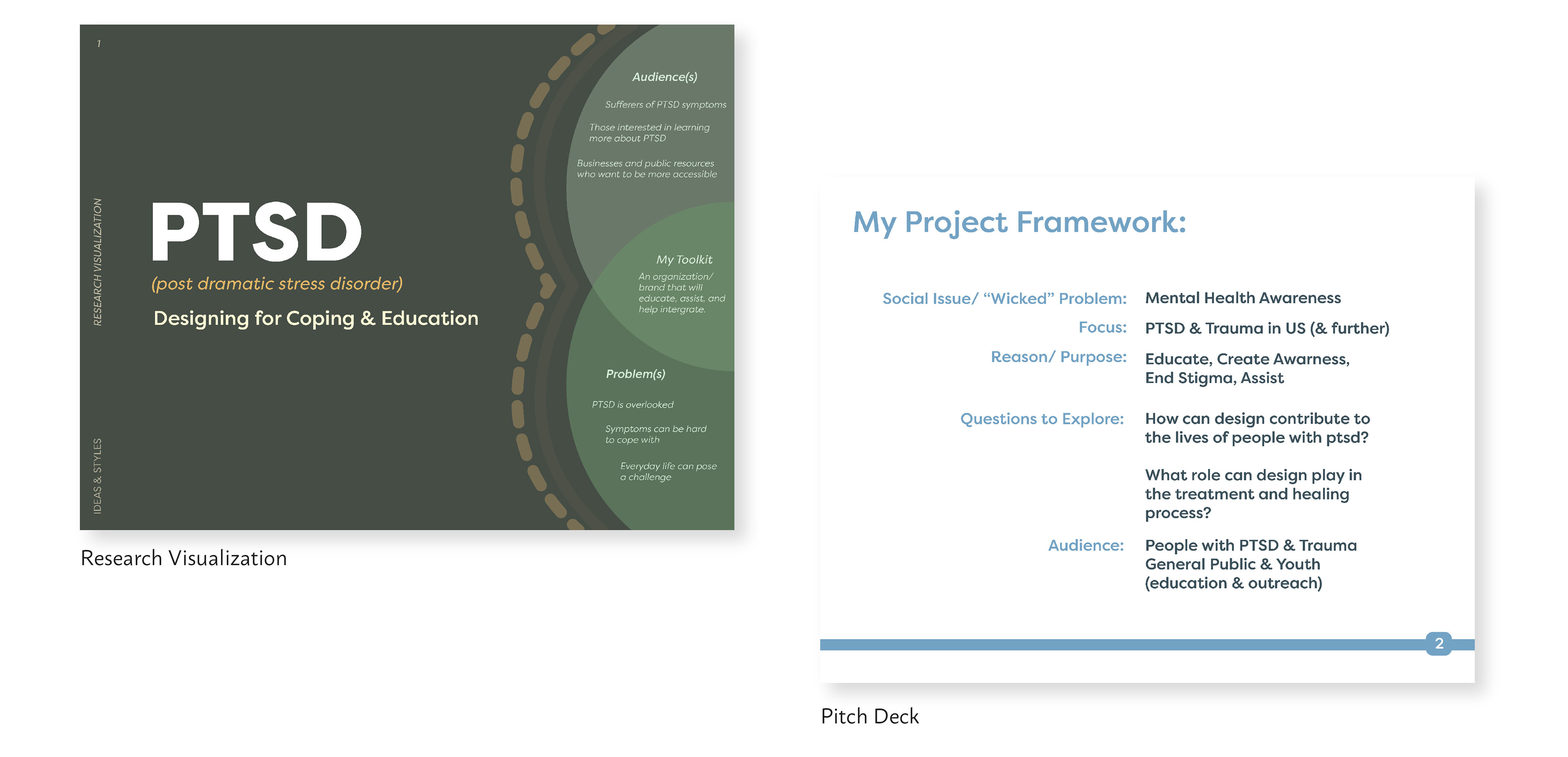
Shown above are sections from my research and toolkit solution visualization. The research process allowed me to guide the focus and direction of my project. Research and defining the topic were key steps in preparing to design the toolkit.

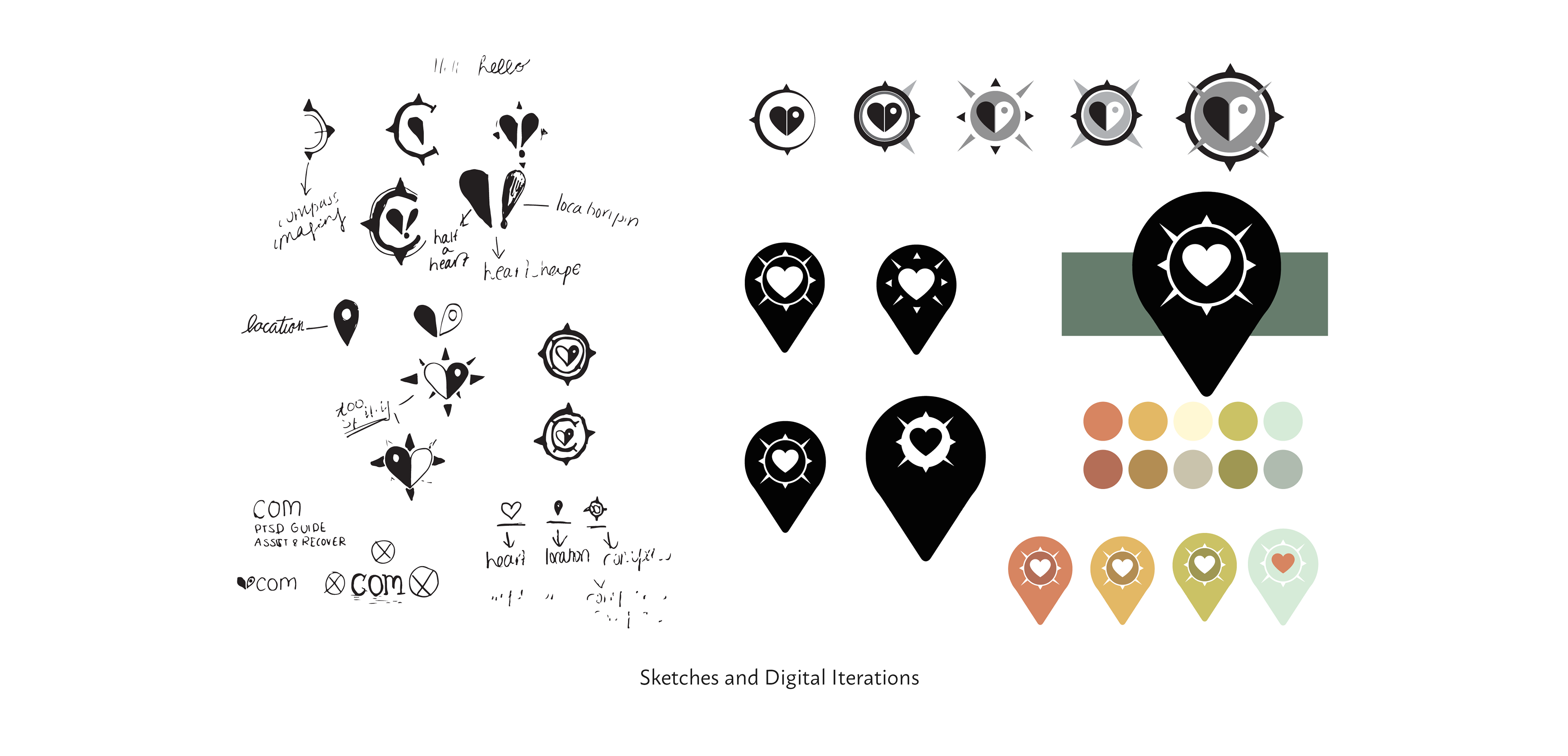
My design process began with building Com’s brand identity and designing a branding guide to drive the following deliverables. Below are my hand-drawn sketches and digital conversions leading to my final logo concept. Results were approached after several rounds of feedback.
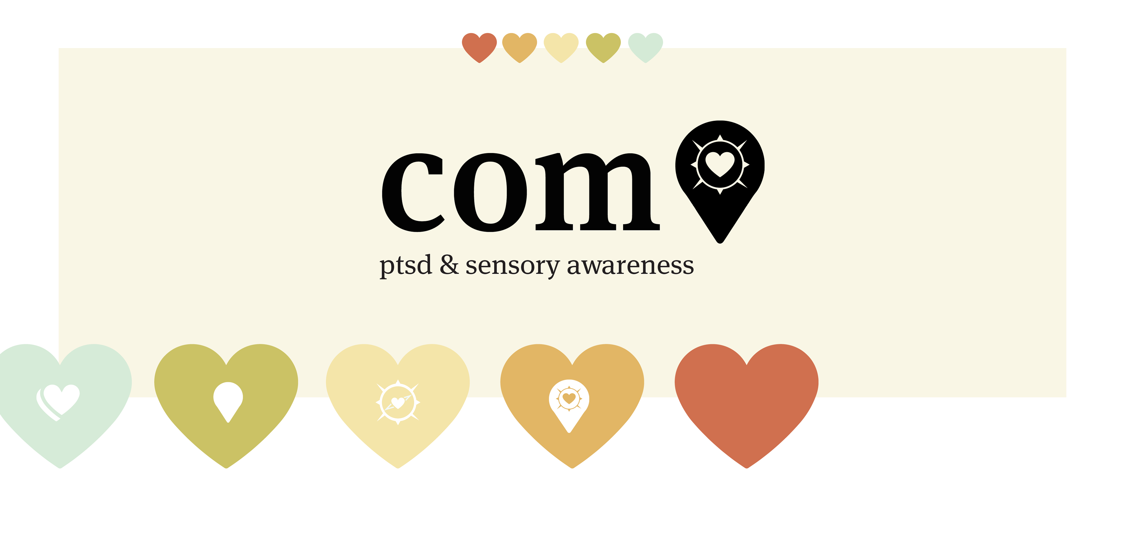
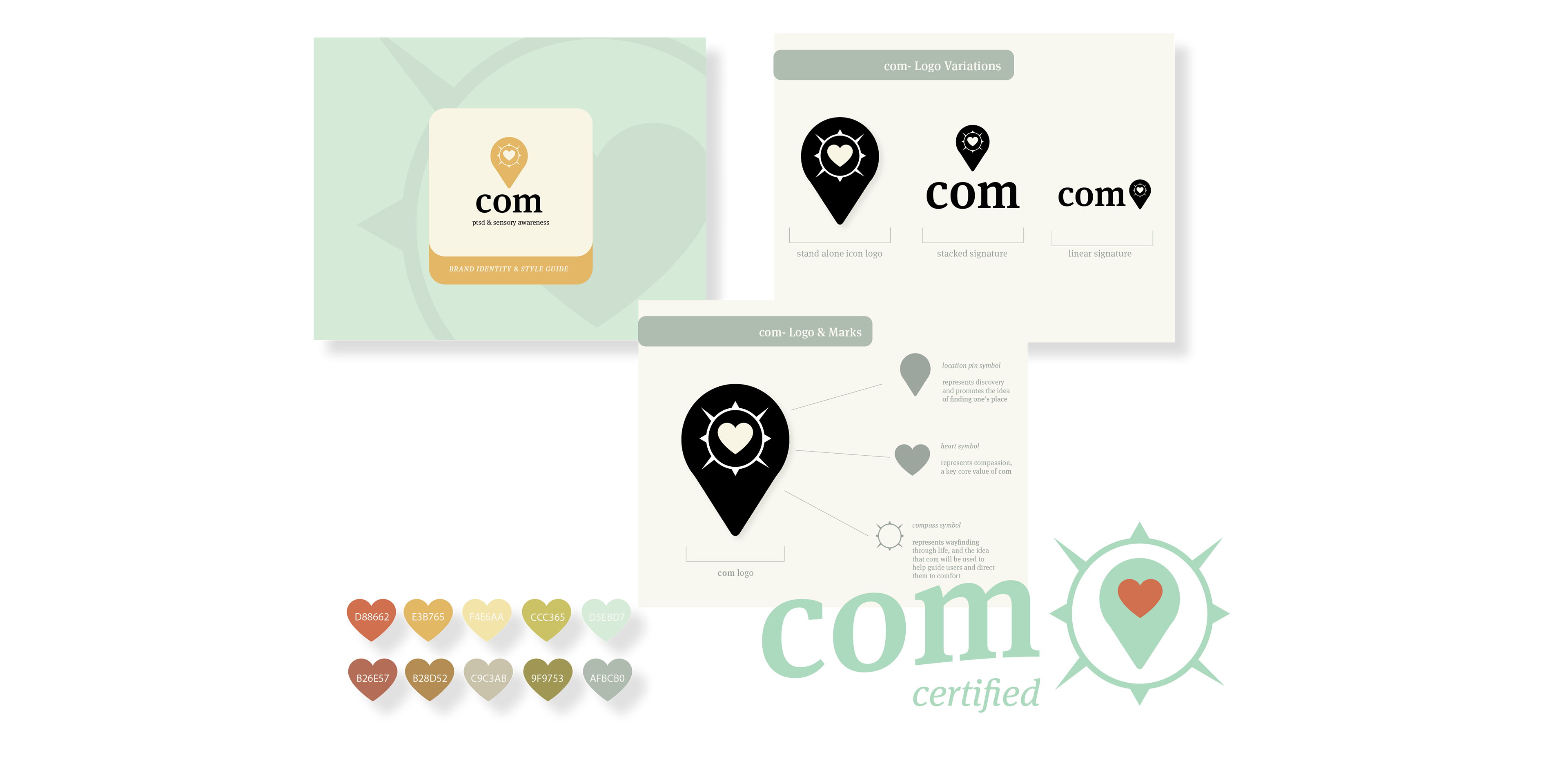
The Com branding guide maps out the symbols, type choice, and color schemes to be used for identity purposes. There is also a breakdown of the main logo and it’s meaning’s related to the company’s mission statement. A location symbol to represent "finding one's place", a heart that represents compassion, as well as a compass to represent wayfinding.

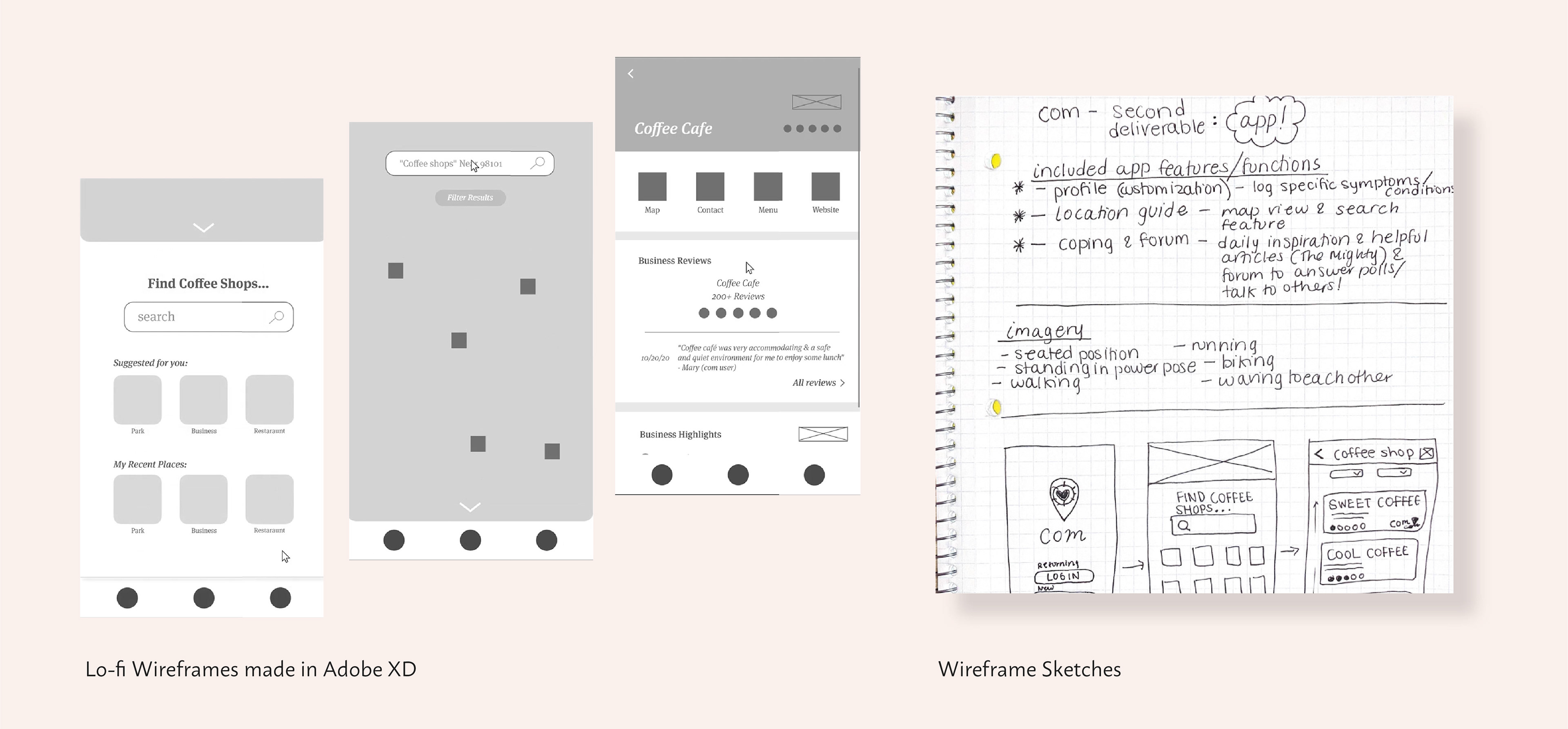
The next steps involved planning out the app features which included a developed map that functions as a location guide, a user profile, and community forum. Keeping the branding in mind, I then developed full wireframes in Adobe XD.
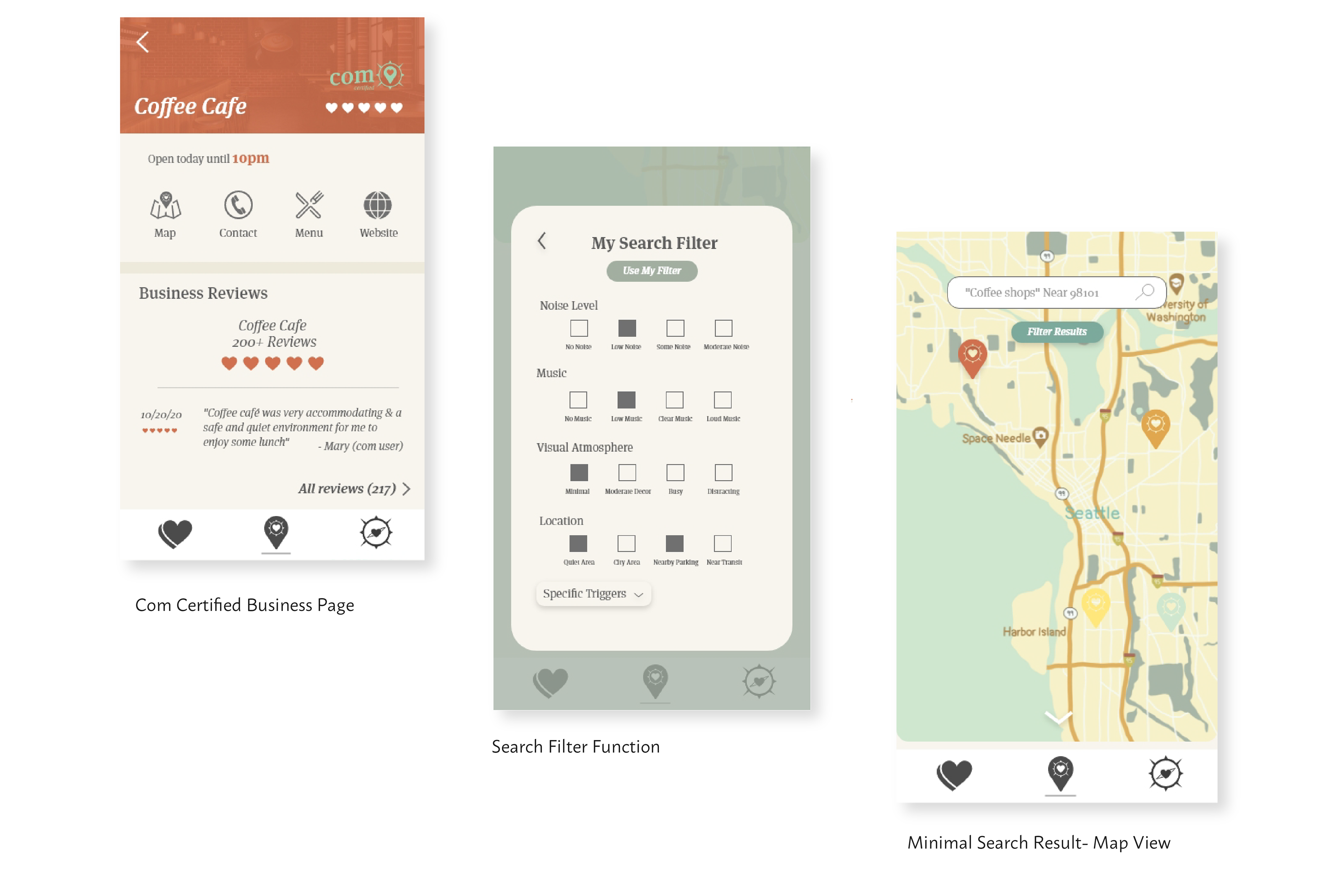
The Com mobile application was designed to help those with PTSD and sensory conditions find places that are suitable for their triggers. The app features a detailed symptom filter, business pages, maps, and a forum to connect with other “Com users”. Businesses and locations that are "Com certified" represent safe and well-reviewed places by a great number of application users to help guide others on where to go.

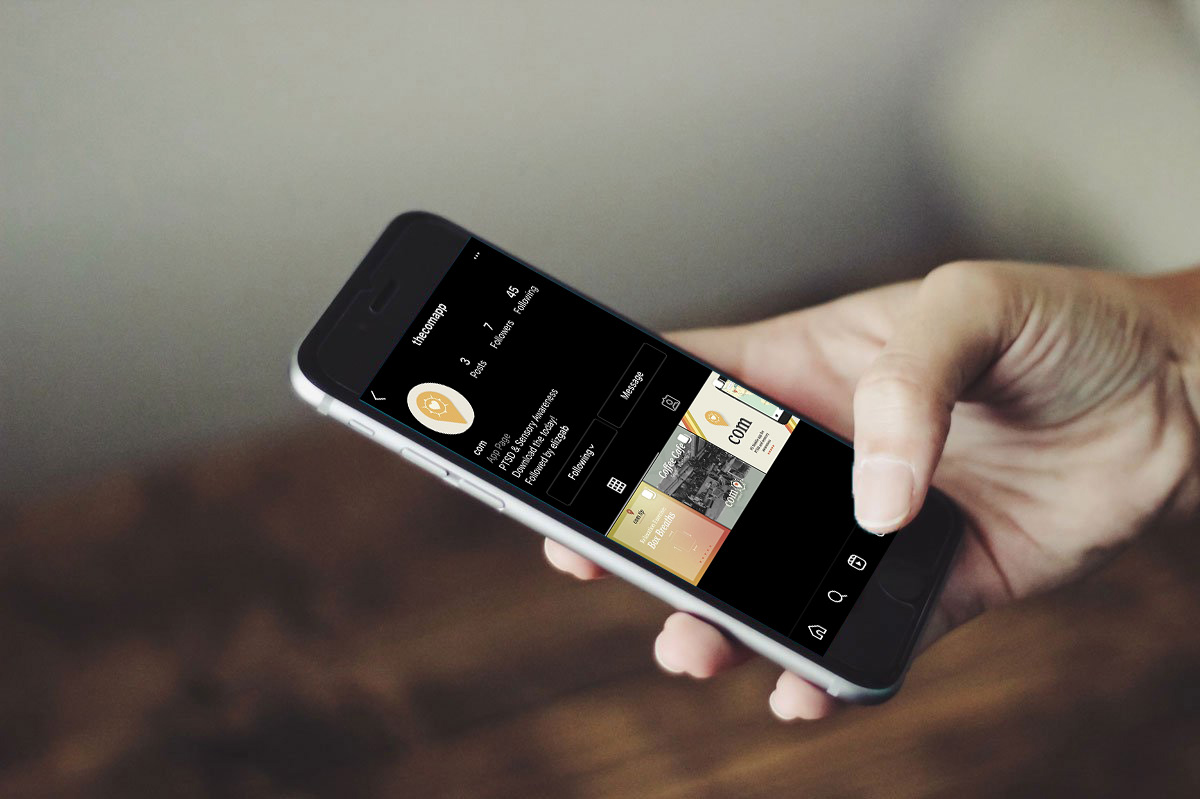
The final component of the toolkit is Com’s social media presence. Having main themes for the post content and strategizing how to use social media to extend the positive influence of Com were ideas I kept in mind as I developed posts & profile content for Instagram.
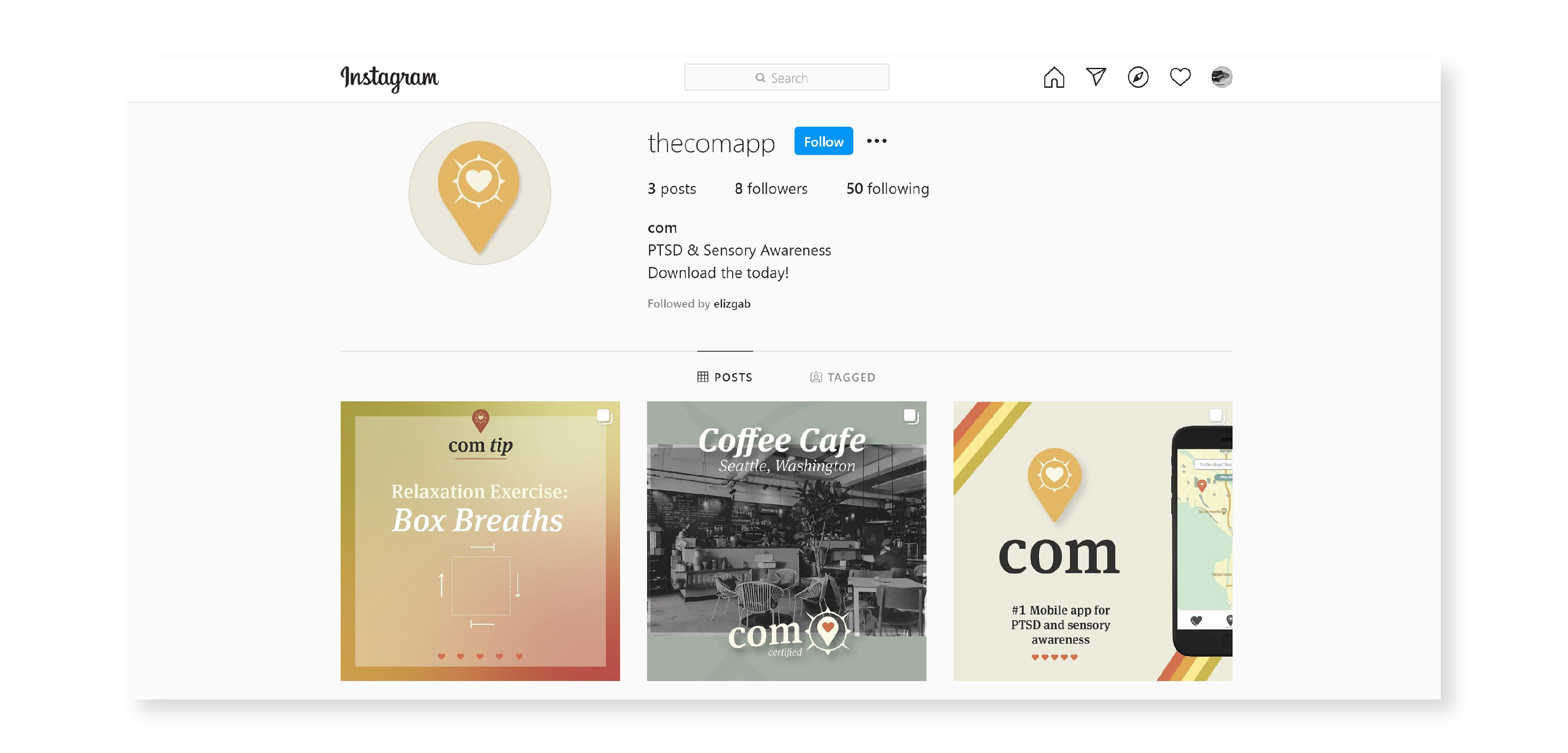
The posts include a Com certified business feature, a promotion to download the app and a breathing exercise to help promote relaxation in a stressed moment or after being triggered. The target audience broadens for social media to cater to existing and new users, as well as loved ones who want to stay informed.