Thrive
UI/ UX │Mobile App
Thrive is a UI/UX based project that serves as a tool for users with anxiety and other mental health struggles. The main function of the app was guided "walk-throughs" to lead users through tough moments through various calming and distraction techniques. Alongside the walk through feature, the app also allows user to log their mood in a calendar, take private notes in a digital journal, chat with other users in a forum and edit their own profile.

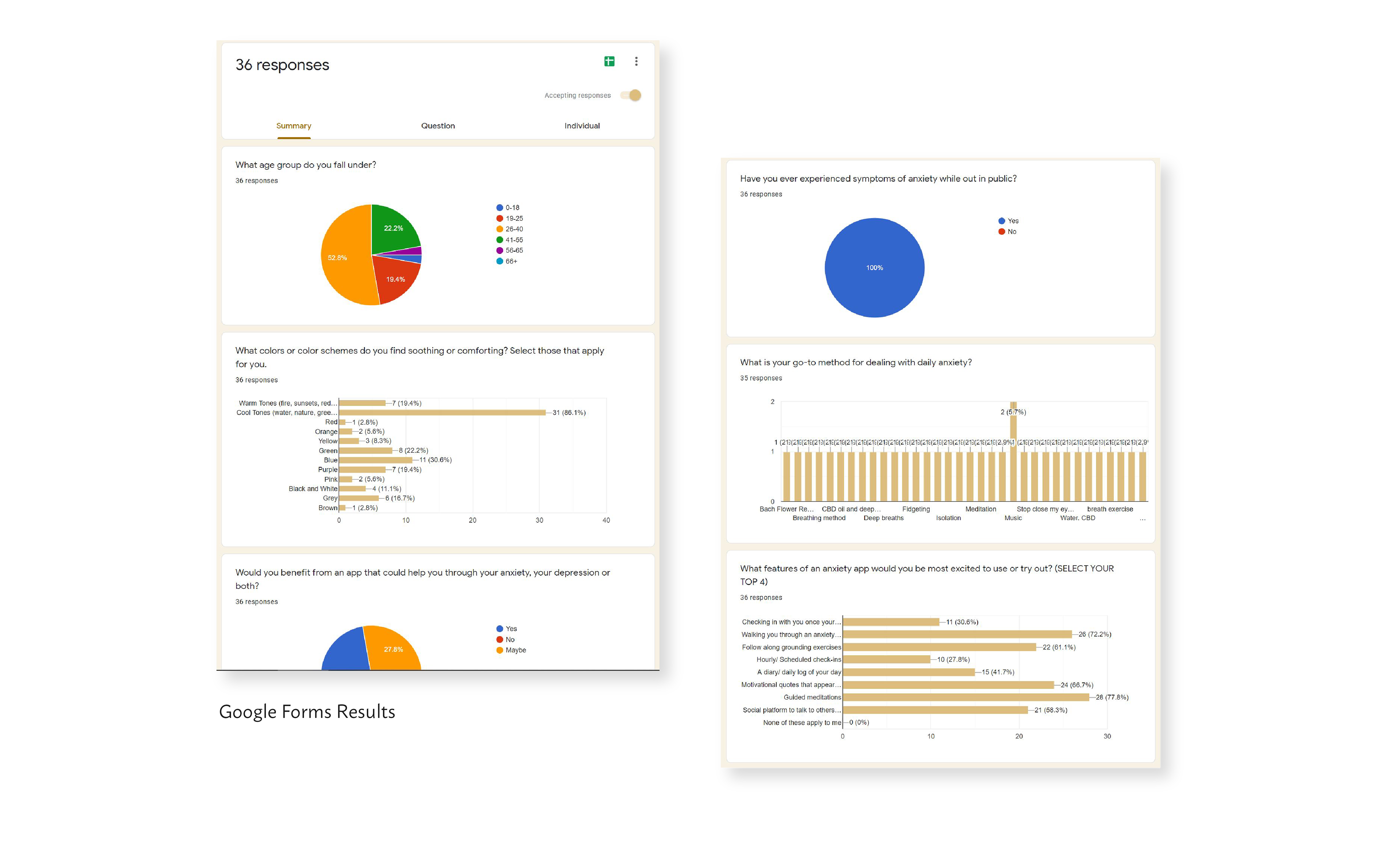
When beginning to design this app, I was encouraged to reach beyond my own perspective and gather the opinions and experiences of others. I reached out to people on Facebook support groups in order to get their anonymous opinions on what features they would enjoy most on an app made to support mental health. I considered asking about things like colors, names, and topics that people would value most, and took these suggestions into consideration.
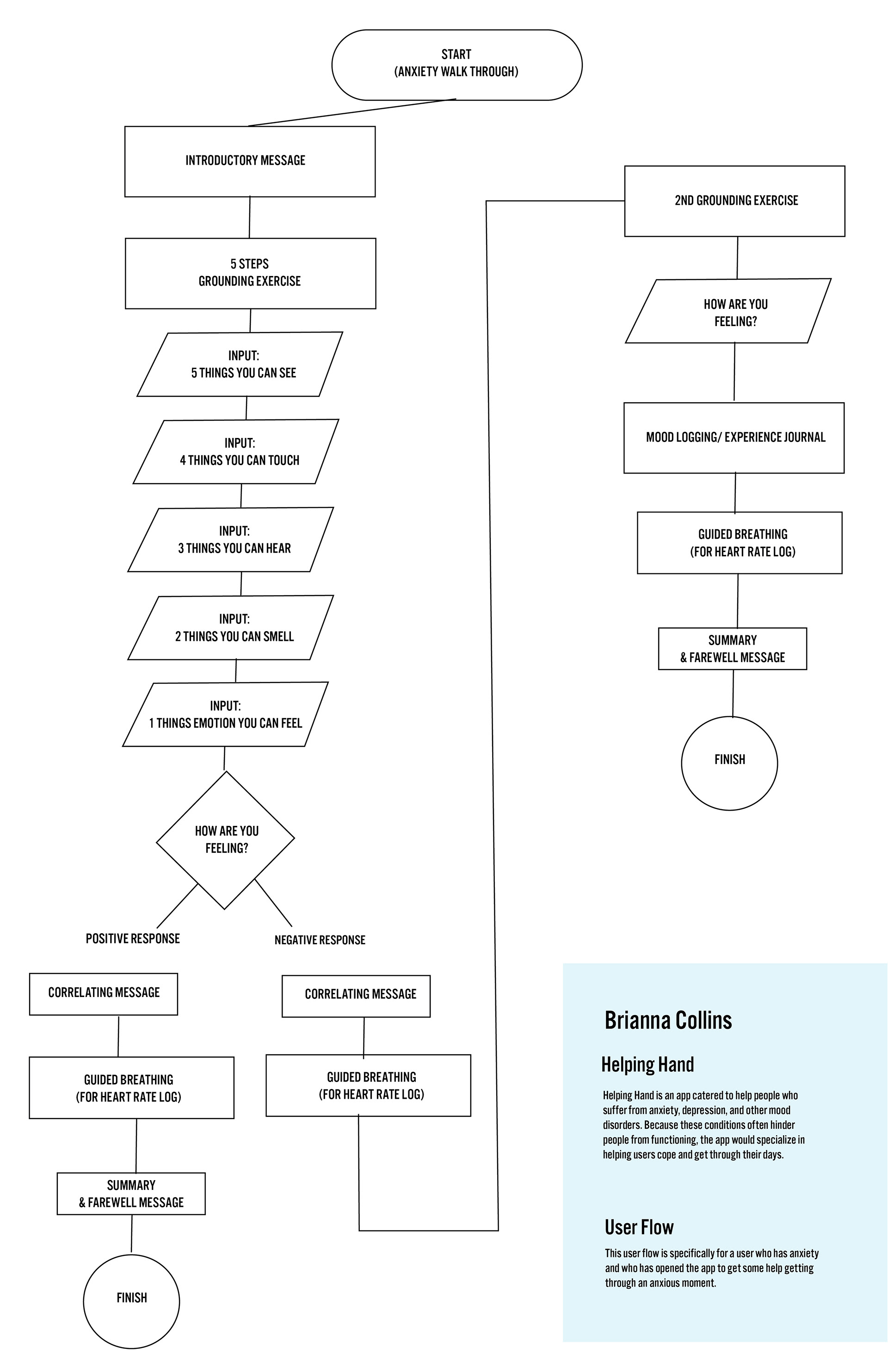
I then began to think about the desired user experience and drafted a flow chart as a precursor to designing the app. The flow was for the main function I would be highlighting with the app which was an anxiety "walk-through".

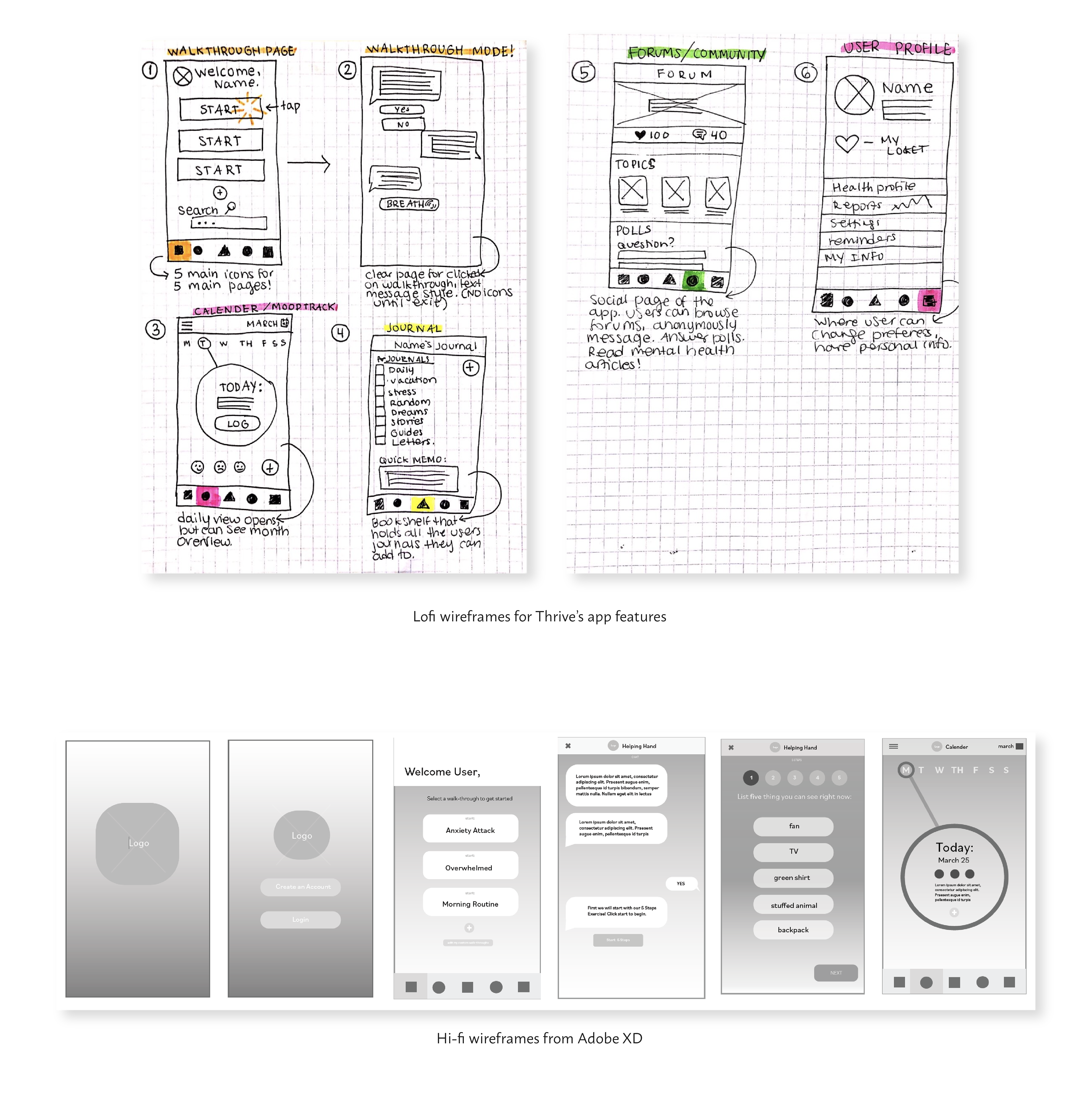
I then used my user flow chart to create "Thrive" in both low fidelity and high fidelity wireframes through a series of sketches and eventually using Adobe XD.
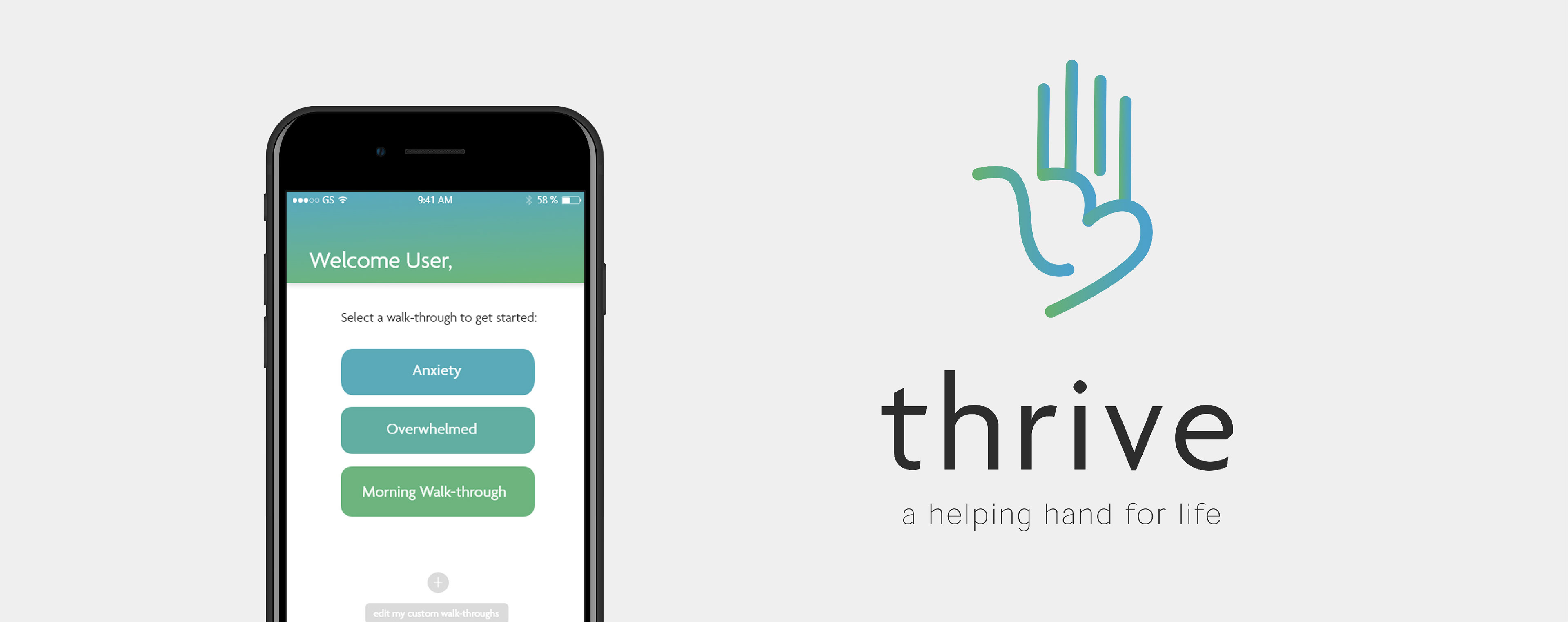
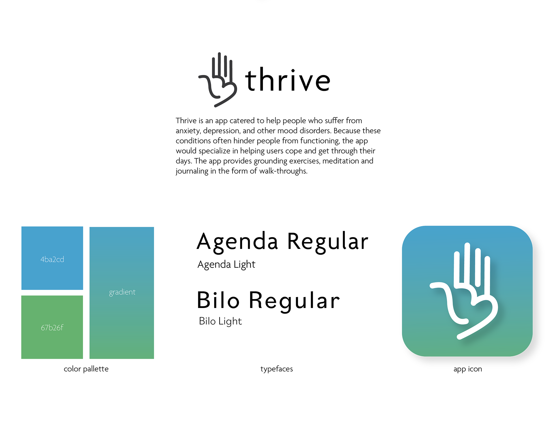
The final branding sheet for Thrive can be seen below. The name came from a suggestion from a user who filled out the google form and their explanation for it stuck with me. "Thrive- because just living ain’t living." I wrote out a goal statement for Thrive to drive the designs and also chose a cool toned color palette to be incorporated throughout my final prototype, a color scheme that was most voted as promoting a calming presence. The logo for Thrive is a hand that also has a hidden heart within the palm, representing the helping-hand aspect of the app when it walks users through difficult moments.

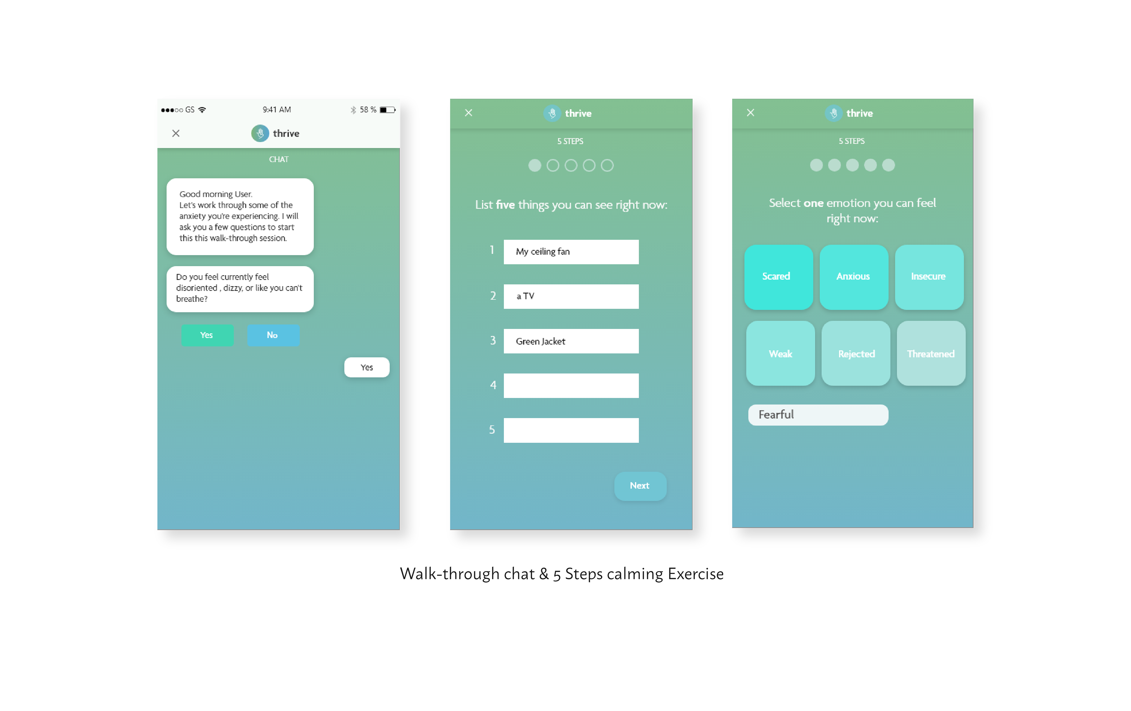
The walk-through portion of the app is an interactive and guided chat which allows the user to feel like they have someone there to help them through a tough moment. Some of the exercises include the 5-Step sensory activity and guided breathing meditations. Users can customize their most used walk-throughs to appear on the very first screen of the application upon logging in for quick access. The rest of the features can be seen below.