Raíz & Wepa
Branding │Package Design
2017/ 2021
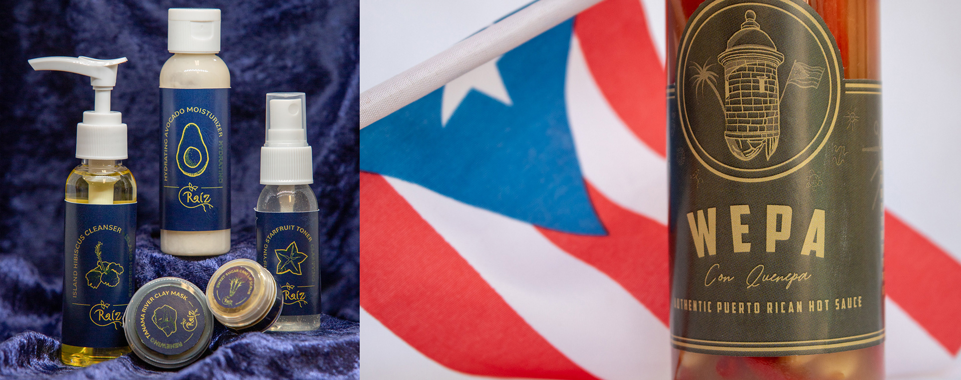
Raíz and Wepa are two separate brand and packaging design projects, both being centered around Caribbean culture and involved transforming a brand identity into physical packaging. While standing as two individual projects, they represent the variety of design that can stem from a single culture and experience.

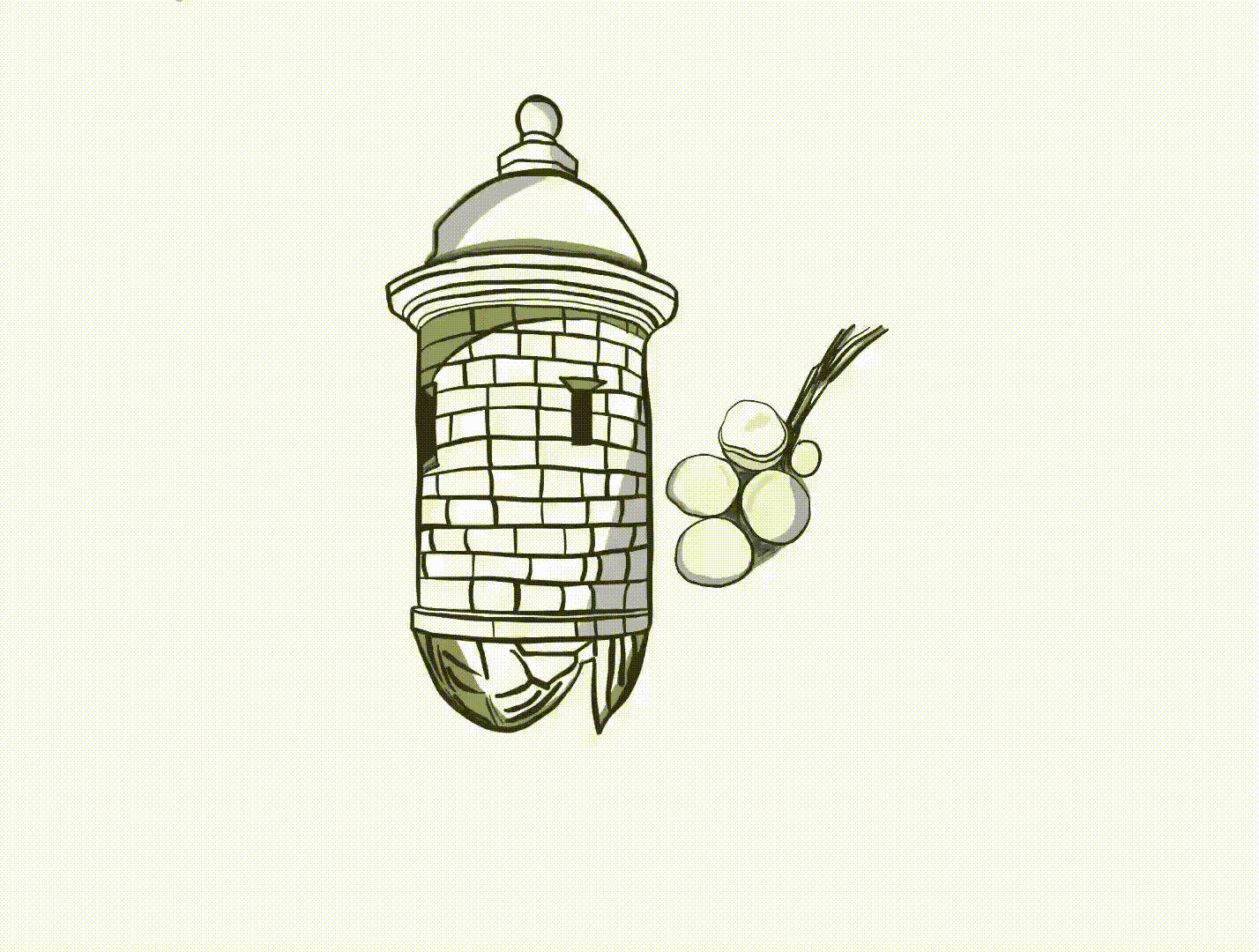
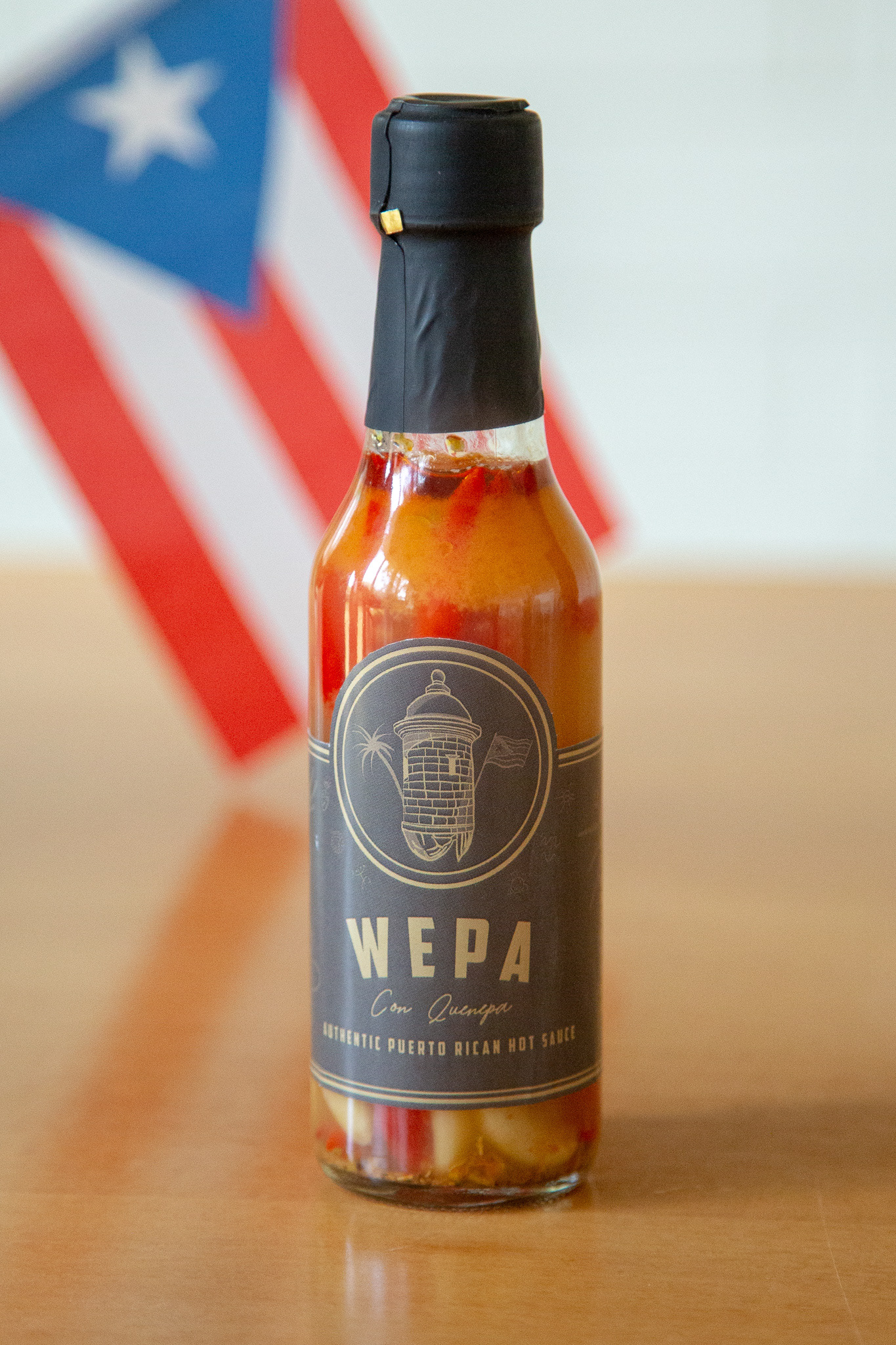
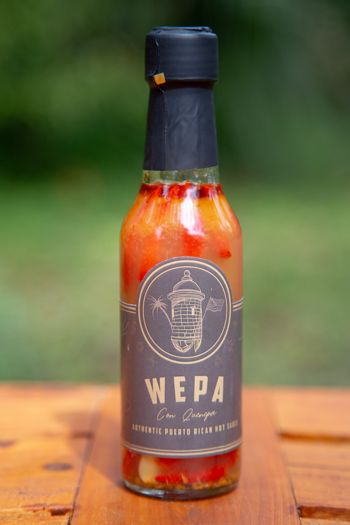
In the Puerto Rican culture, the word "Wepa" is a celebratory term. I chose this to be the name of the hot sauce. My process began with brainstorming & digital sketching. I drew elements related to the island, such as landmarks and the flag. I decided to use colors found in the Castillo San Felipe del Morro fort in San Juan, as well as Taino symbols that are connected to the Puerto Rican culture and history.
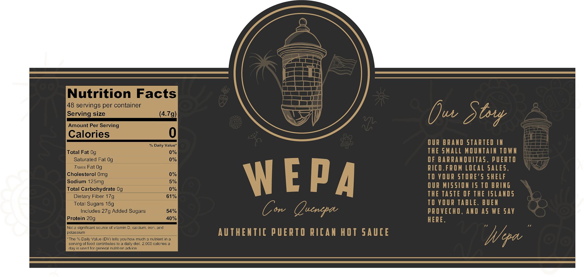
Final steps in the process included printing out the label, filling the bottle with my Abuela's authentic hot sauce and then sealing it.

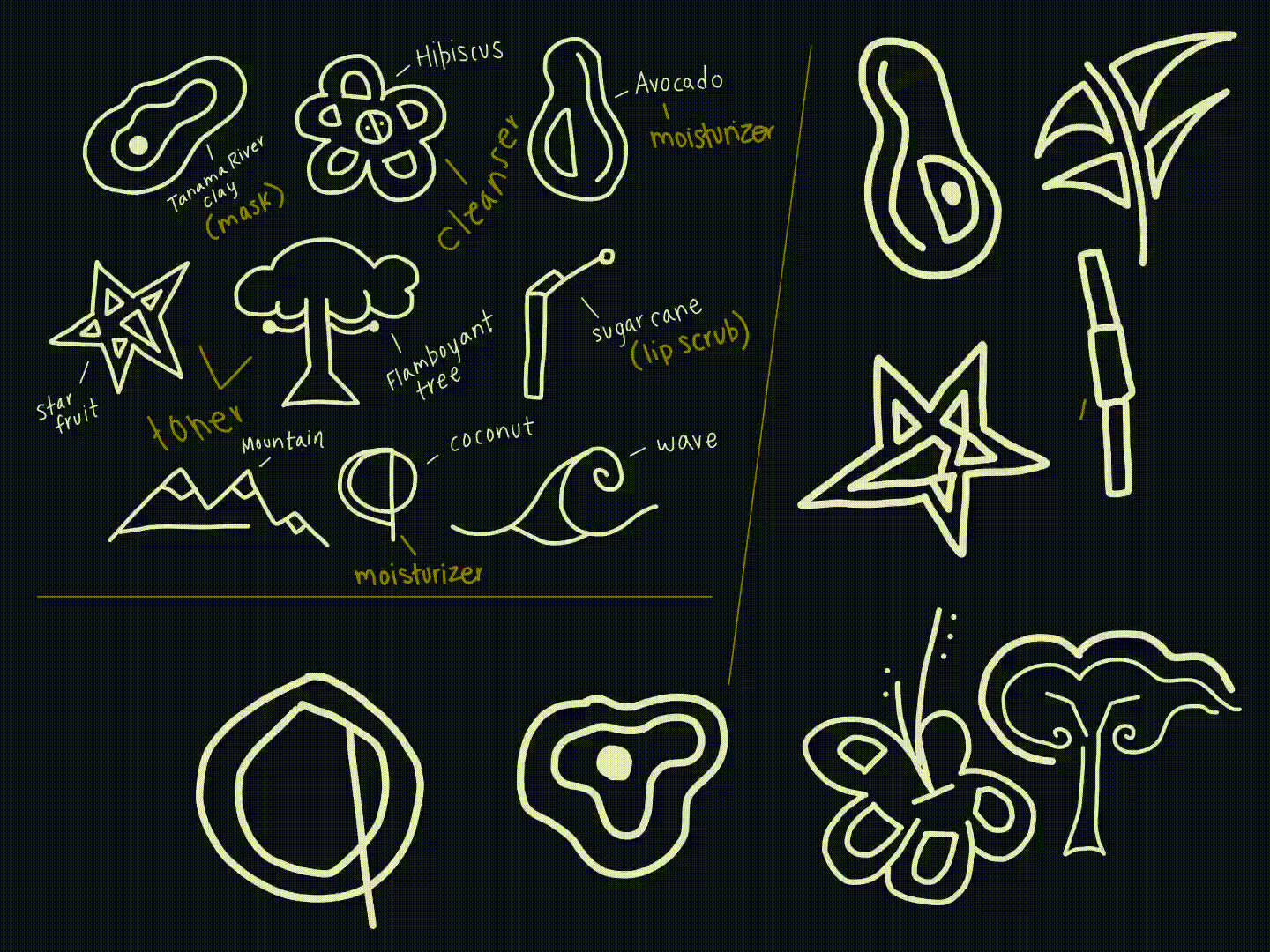
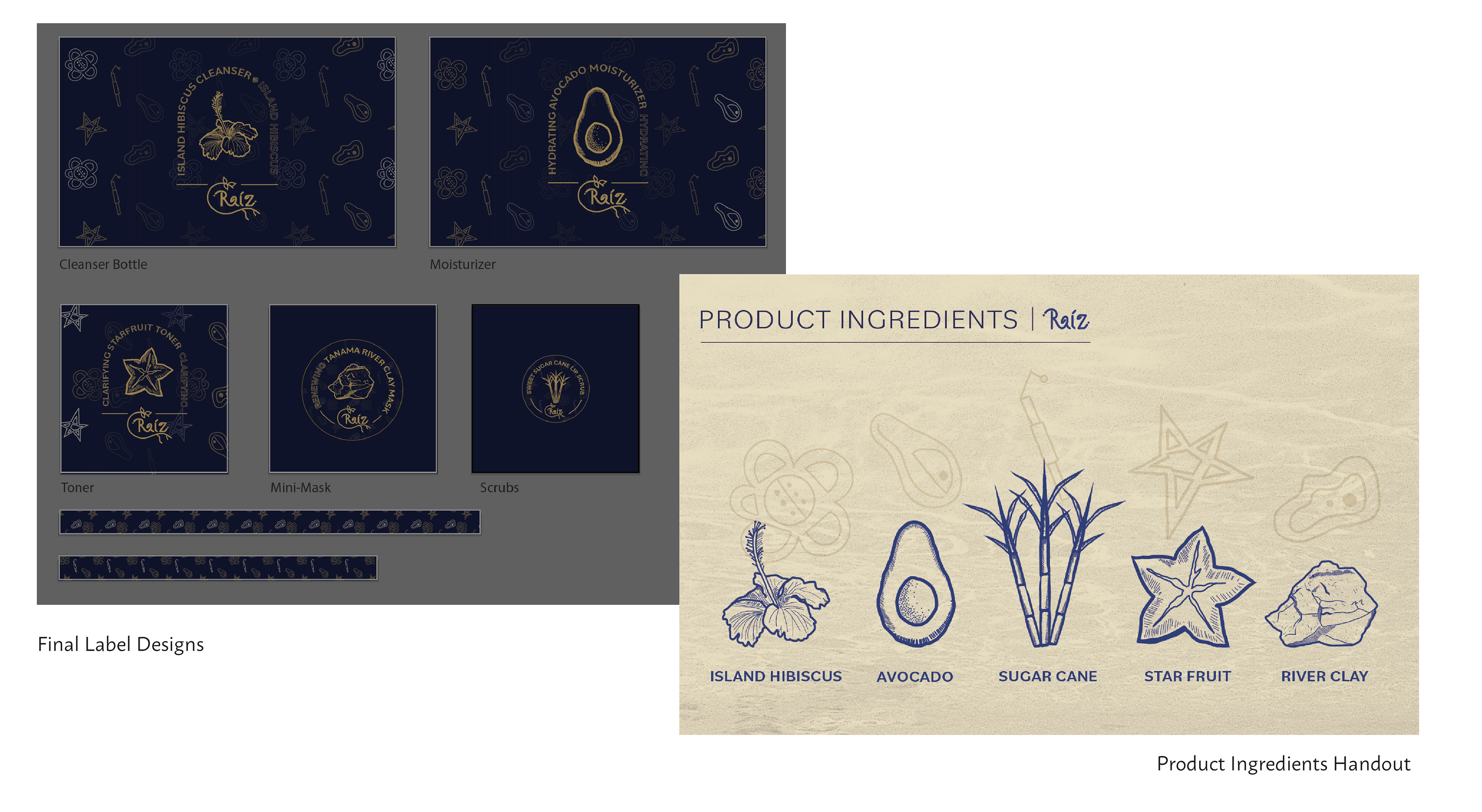
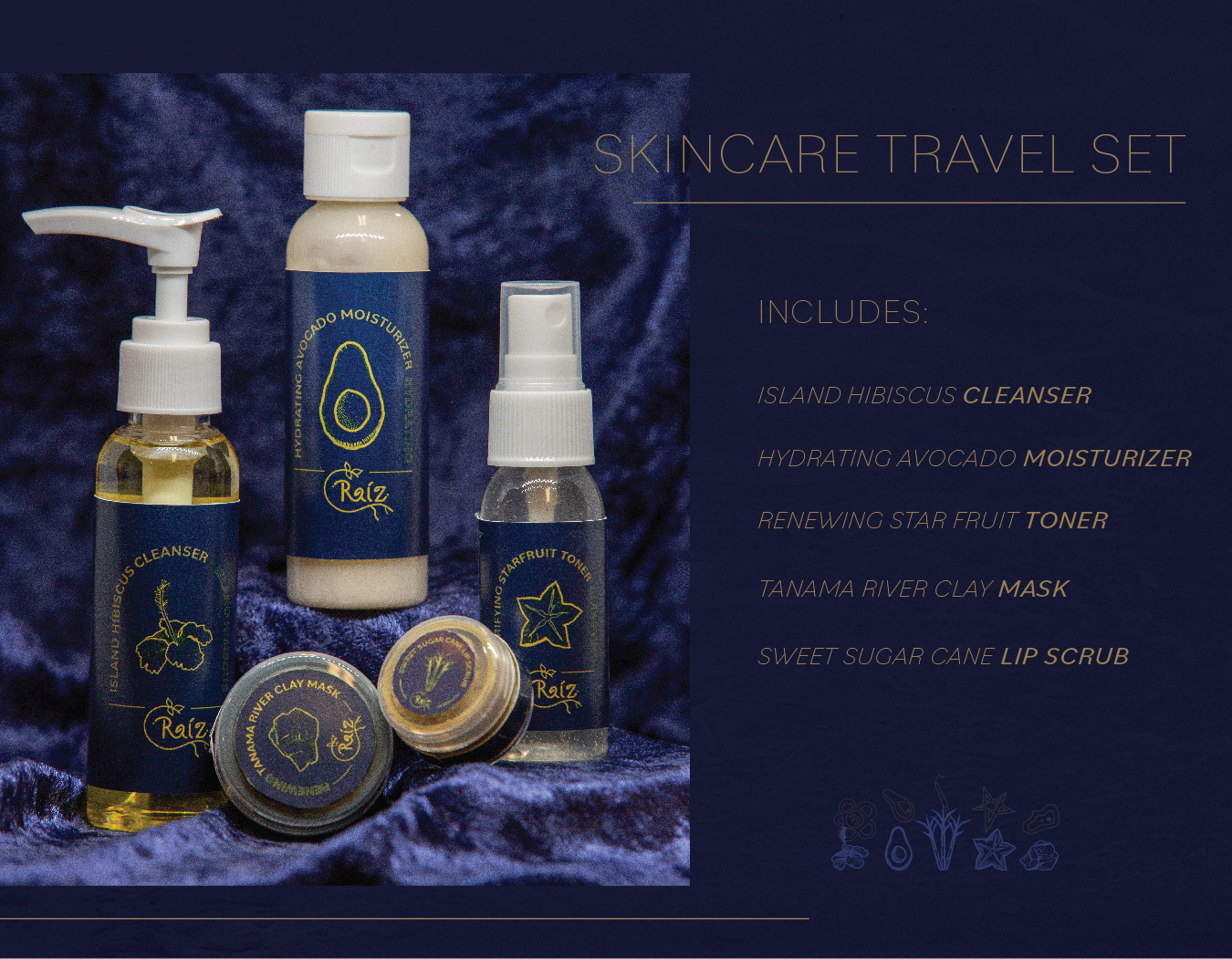
Raíz was a continuation of focusing on Caribbean culture by creating a brand identity for a skin-care line made with products that exist in Puerto Rico. Part of the inspiration behind the brand concept stems from my first hand experiences in Puerto Rico and the many fruits, vegetables, and other natural ingredients I have come across while visiting.
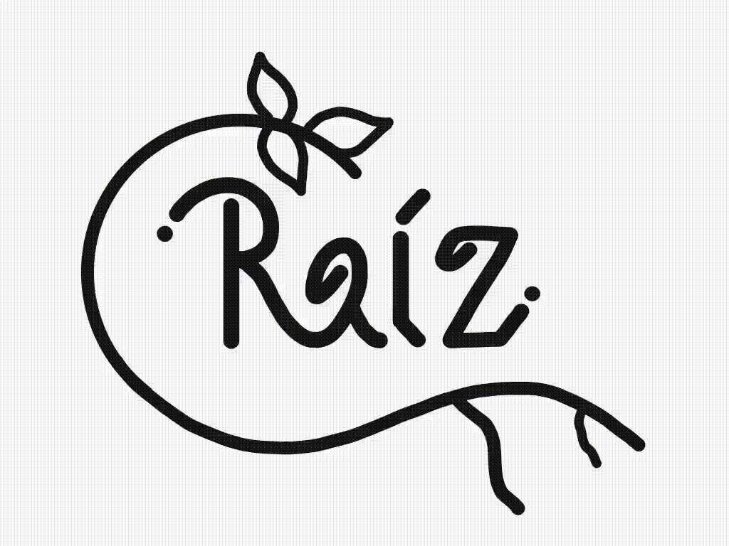
The name Raíz means "root" in Spanish. With the idea of including unique natural ingredients, the reference to roots and being sources from the earth inspired the rest of my design decisions. Above are the iterations and process of hand drawing the brand's logo. I carried on the concept of using Taino symbols and decided to create my own symbols for the main ingredients to be featured in the skin care line.